Say It with Your Lens This Time: A Look into Magnificent Visual Storytelling
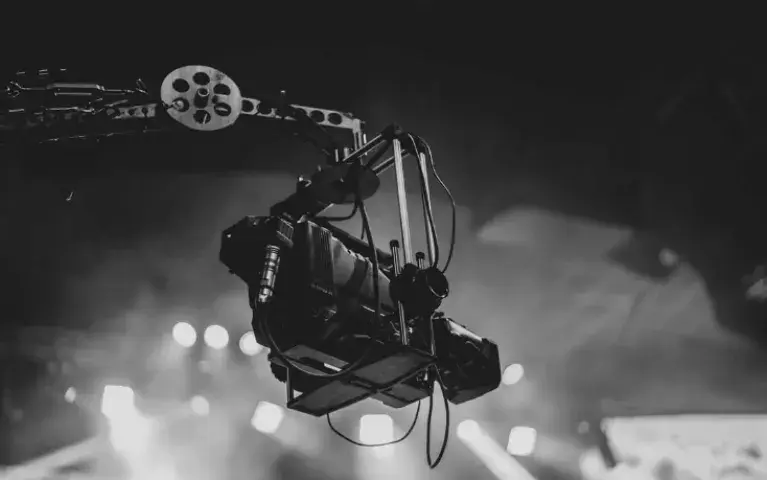
The Academy Award winning cinematographer Conrad Hall said: “Cinematography is infinite in its possibilities, much more so than music or language.” The avid readers of TopLine are familiar with film as an image driven art, without those images, we have nothing. A film’s cinematography delivers its plot, and without the visual context a story can barely be told. A director of photography can almost always enhance any plot with striking visual beauty, regardless of colour and technique. On the other hand, another art form goes unnoticed, it is not visual, but it is the only way a visual form of cinematography can work.
Editing is overlooked but it is a pillar of filmmaking that ties the screenplay, the direction and cinematography altogether. A bad edit can mean disaster for a film, but a good edit can make the dullest of stories interesting. I also find film editors to be the unsung heroes of the film industry as there is very little realisation of how much work goes into editing, especially when a good editor’s job is for the viewer to not notice them. Furthermore, both editing, and cinematography come hand in hand with production and set designs; a director of photography can make a set pop in colour, sing in harmony with the story or even a major plot point of the script itself.
Whereas there are countless movies that use the lens of their cinematographer, the wit of the editor and the countless hours of hard work of the cast and crew, whether actors, set designers or filmmakers, a list of every work of visual cinematic art available will be endless. This list may not include your favourite directors of photography or their films because of its intimate and personal nature. The works of the American filmmaker David Fincher, English director of photography Roger Deakins, Mexican cinematographer Emmanuel Lubezki and Dutch cinematographer Hoyte van Hoytema might not be included here but that does not mean their work is not appreciated or cherished by TopLine. Here are my very personal picks for visual storytelling that I find worthy of remembrance.
Doctor Zhivago (1965)
I have talked before about “Lawrence of Arabia (1962)” and how its cinematography was mind boggling today as it was in 1962; its director, David Lean, brought back his director of photography, Freddie Young with him again to tackle the Russian novel adaptation into the big screen. What Young did with the red rocks and yellow dunes of southern Jordan, he does here again with the blue ice and white frost of northern Russia. Much of this epic love story unfolds in a haunting visual beauty, painting a picture of 1917’s October Revolution that’s difficult to forget.
“Doctor Zhivago” weaves its story with magnificent editing; Omar Sharif’s lines are reflected perfectly with perspectives of Julie Christie mimicking the poetry of the original book. The story takes us from the populous streets of Moscow and seamlessly transition to the harsh winter of northern Russia, in a frozen wasteland and tundra of ice enveloping the set, the editing and the acting itself.
The Lord of The Rings Trilogy (2001-2003)
There is no way around it. The Lord of The Rings is a genius work of photography, cinematography and editing wrapped into a majestic trilogy that put Peter Jackson and his native New Zealand on the map. Location scouting took the crew to the most isolated regions of New Zealand to recreate Tolkien’s magical and extensive worlds. Most importantly, the entire series is known for blending cutting-edge CGI, miniatures, props, and live action acting that has not been seen since Jurassic Park (1993).
Tolkien’s pages go on and on in describing the scenery of the mountains, forests, and plains in which the story takes place. This is a literal dream come true to filmmakers that struggle with painting a picture of the world they are adapting to the big screen. The Australian director of photography, Andrew Lesnie, accomplished a powerful visual adaptation in startling shots, whether static or in motion, mounted on cranes or on shoulders, the cameras plunged into valleys and soared over the impressive terrain of the mythical Middle Earth. Lesnie continued to work with Jackson for several movies, including the visually impressive “King Kong” (2005), the haunting images of the “The Lovely Bones” (2009), and “The Hobbit” (2012) series, whose greatest fault was excessive reliance on CGI as opposed to cinematography.
Additionally, “Lord of the Rings: Return of the King” (2003), the only fantasy film to ever win an Academy Award for Best Picture, also won an Academy Award for Best Editing. The post-production on this film took a ridiculous amount of effort; around two million feet of film (or 610,000 metres) were sifted through for the edit of the trilogy’s climax combining the last two films and their many individual stories for the finale.
The first time I have seen this tour-de-force in 2005 on a relative’s home theatre system it provoked a visceral reaction from me; I felt physically ill and disturbed to my core, especially with the opening Normandy sequence and the Omaha beach invasion. The Polish director of photography, Janusz Kamiński used a few handheld cameras to capture an intimate yet immediate visual storytelling of the invasion as soldiers stormed the beaches.
The ground-breaking cinematography captured a disturbing amount of combat and personal injury that has never been seen before up until then. The chaotic and nightmarish opening scene also comes draped in a realistic air of young men drafted for the war facing their death. The climate of the opening sequences is filled with blood and sea air, and personal close-ups of the final moments of thousands of terrified men.
The haunting 20 minutes alone are enough to bring viewers back for a second time, as this was one of the few war movies that did not glorify war itself and used graphic imagery to do so. Furthermore, the editing of this film brings this almost three-hour-long spectacle to a riveting pace, tying a story that captures war-torn France in a light never seen before, or since.
I left the theatre in January of last year after watching “1917” (2019) thinking that it was one of the closest experiences I’ve had to “Saving Private Ryan” but it was missing the intimacy in order to focus on the impossibly long-shot it’s known for. It should be worth noting that this is the last film edited on a non-digital editing system to win an Academy Award for editing, everything from that point onwards has been digitally done.
This Martin Scorsese film tells the story of two Portuguese priests on a mission to Japan to locate their mentor. Scorsese brought his Mexican Director of Photography, Rodrigo Prieto again after hiring him for “The Wolf of Wall Street” (2013). While the before mentioned was a loud and a chaotic exploitation film (that I did not care for very much), “Silence” utilises Prieto’s abilities to tell a visually powerful religious drama with striking stark imagery, even for a Scorsese film.
The amount of careful planning that went into the cinematography of this film is intense; Prieto sculpted the look under impossible conditions through the roughest locations of rural Taiwan to give the aura of 1600s Nagasaki. To capture the feel of Catholic cathedrals of Lisbon pre-Earthquake, the ruins of the Portuguese colonial cathedral of São Paulo in Macau proved to be an excellent choice.
This is one of those films that you recommend with a detailed description justifying this recommendation; it is weird, it is surreal, and it is a bizarre blend of civil war era Spain and Narnia. Yet it is one of those films that are simply beautiful. Guillermo Del Toro used his long-time cinematographer Guillermo Navarro, and it won a much-deserved Oscar for Best Cinematography. Navarro is as integral to Pan’s Labyrinth just as much as any other of del Toro’s works.
Pan’s Labyrinth is so dependent on its visuals as it weaves this dark world, and it holds a fantastic delicate balance between lightness and darkness. The fluid camera movements guide viewers from the dark realms of fantasy into the cold light of a very painful reality. The editing done by Bernat Vilaplana allows for the two tales to intertwine like a fantasy book, seamless and dreamlike.
In the same way I may describe and justify why I would recommend Pan’s Labyrinth above; I would not recommend “Enter the Void” and I will spend two minutes apologising that I have brought it up or even mentioned it. Gaspar Noé is a controversial filmmaker to put it very, very politely; everything about his work is oozing with controversy, and he has some serious issues that I am almost certain he is not ready to discuss with anyone, at least not yet.
My story with Noé started when I watched “Irréversible” (2002) over a decade ago and immediately tossed it in the trash afterwards; visually striking and mentally scarring, I swore off his work forever, but I went back for “Enter the Void”. Did I like it? No. Did I love it? Also no. Was it visually impressive? Absolutely. “Enter the Void” remains nonetheless a Noé film, it is almost designed to shock its audience with its graphic content of illicit and explicit drug abuse as well as copious amounts of graphic sexuality and nudity.
In short, this film is about a drug deal gone horribly wrong, an American young adult and his sister who found themselves living in a tiny apartment in Tokyo and a death experience that drags its viewer by the eyes through Japan’s underworld of crime and nightlife.
Director of photography Benoît Debie simply paints and colours every single frame of these grim tales with the neon lights of Tokyo. Noé came back after this with “Love” (2015) , a film that lacked most of the experimental cinematography in the rest of his movies, and simply relied on the pornographic shock-values he was known for; it was not received with the same amount of appreciation as this one. Debie took the lessons he learnt here and implemented them in “Climax” (2018), and it showed. 40-minute-long crane shots, impossible angles, and viewers that probably held onto their seats as the dizzying sensation that washed upon them was perhaps unbearable at times.
Due to the graphic nature of this piece of film, I seriously thought twice about including it here. However, filmmakers are now increasingly studying Debie’s bold use of colour and camerawork, and whether you like this film or found it excessive, its techniques are absolutely revolutionary and destined to become mainstream.
I am not going to tell you about this film. Your friends probably told you about it and if they haven’t, you should be telling them about it or better yet visit the Film Library of the Royal Film Commission and check out a copy. This Korean powerhouse of cinematic achievements is perhaps one of the best films of the last decade, a simple and relatable story of class warfare and an honest conversation about upwards mobility in the socioeconomic ladder. To tell this story, filmmaker Bong Joon Ho brought Director of Photography Hong Kyung-pyo and Editor Yang Jin-mo to his team, and together they changed what it means to tell a visual story through cinematography and editing.
Stairs literally and figuratively represent the social divide portrayed between two very different Seoul families and Hong Kyung-pyo made sure that the visual image is accurate, sharp, and subtle yet subconscious. Yang Jin-mo edited the scene to mirror the acts perfectly and one might need a second viewing to understand the complexity of the process and its perfect assistance to the storytelling unfolding in front of the viewer.
The Night of Counting the Years (1969)
This is the golden age of Egyptian cinema right here. “The Night of Counting the Years”, better known in its native Egypt as “Al Mummia”, is a slow-moving film in every sense of the word. It is also a rewarding experience wrapped in a layer of mysticism and contrast, whereas the plot is ambiguous and shrouded in mystery and convoluted language, its director of photography, Abdel Aziz Fahmy, set the bar high for Egyptian and international cinema alike.
This was the most successful full-length feature film by Egyptian filmmaker and local legend Shadi Abdel Salam, who started his career assisting Roberto Rossellini in making “Legions of the Nile” (1959). The perfectly centred angles and shots are almost a direct reimagination of many of Stanley Kubrick’s earlier work. The editing, done by Kamal Abu-El-Ella, manifests the continuity between ancient and modern Egypt and highlights the film’s message of preserving a culture.
Chronicles of the Years of Embers (1975)
What does it take for a film to win arguably one of the most prestigious awards in cinema history in any given year? An epic tale of an independence movement from perspectives unseen and unheard of at the time, those of a peasant. What might seem like a cliché now was virtually ground-breaking in politically heavy dramas from the 1970s; but Algerian filmmaker Mohammed Lakhdar-Hamina’s historical drama’s impact was enough to win the Palme D’or against Martin Scorsese, Werner Herzog and Michelangelo Antonioni and continues to be the only film from the region to do so.
The film often drifts between epic shots, courtesy of its director of photography, Marcello Gatti, and cinéma verité almost documentary-like intimate portraits of the story that the film is trying to tell. It was a vicious point of contention in French politics at the time and was attacked mercilessly by some groups upon release.
“City of God” sets the bar high for handheld cinematography, or any other form of cinematography if I am being completely honest. It is the portrayal of a beautiful world full of topical beauty and also the story of a green inferno, but most importantly it is a coming-of-age story about the have nots and have nothings, and the cinematography by César Charlone will make sure of it. From the heat of Rio de Janeiro’s backdrop to the unfinished suburbs and planned favellas, you are doused in sweltering red and orange, and the editing of Daniel Rezende brings the rich frames into the final reel in a breath-taking and exhilarating experience.
“City of God” is not a happy story, but it is not a movie of sorrow either; it’s a film that makes absolutely sure you are aware of the multi-dimensional characters, their motivations, dreams and hopes, and will make sure it will utilise every technical thing it can in order to tell you that message. This is a film that screams at you, not in words (although there is a lot of screaming happening in it) but with handheld cinematography and seamless editing, perhaps that is why it is my choice as one of my favourite visual storytelling in generations.
For an extensive list of films available to the public, please visit the Film Library of the Royal Film Commission. Keep the conversation going at @FilmJordan and @RickHindi. Which film has your favourite cinematography and why?
*Rick Hindi was the Communications Coordinator of the Amman International Film Festival (AIFF) in its inaugural edition; he has a passion for films, international relations, linguistics and anthropology.

